The purpose of this assignment is to develop our skills on the “Pen Tool” in Adobe Illustrator. Our goal is to create a realistic object by using a real photograph as a reference.
The original Image and Supporting Image:


Vectored Results:

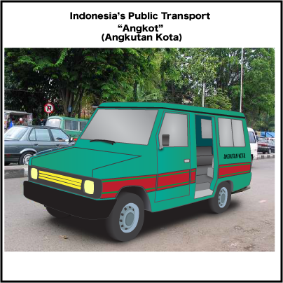

*Angkutan Kota means City Transportation
For more infos about Indonesia's Public Transport click here
The images that shown above are vector graphics. But I saved them as .png formats. I saved them as .png formats, because based on this website and this website that I read, the format .png is more stable for the web, it has more colours compared to the others, it could remove jagged edges with the Anti-Aliasing option and it produces better quality rasterized images.
The procedure about how I created this artwork is first of all I went to a website which is Google, and I searched for the images that I wanted. By the way, the first object that I chose was a traditional instrument. But I decided to cancel it, because the instrument is kinda small. So I decided to choose a car as my object. Anyway, then, I opened Adobe Illustrator and create a document with the option of 400 x 400 pixel and RGB colour mode, I opened the picture and resize it with the “Selection Tool”, and then I started to create the shapes for the car such as the body, the bumper, wheels, windows, and the doors. But, before I began creating things, the first thing that I had to do is create the layers. Because they will help keep the document organized and easy to modify. After that, I created the shapes of them on their layers by using the “Pen Tool”. The techniques were beginning by placing the anchor points on the paths that I wanted. For example, let's say I want to create the shape of its body. So first of all, all I need is to go to its layer and create the path, which is by following the body's shape and place the points around it and remember don't place to much points or you will end up having a complicated and an odd result. After I did that, then I filled the paths with colours and strokes which is by going to the bottom left sidebar and pick the colours. For the wheels, to get the 3D effects, all I need was just use the "Blend Tool", The procedure was first of all I created the shape of the wheel and duplicated it by going to Edit->Copy and pasted it behind the first shape. After that, gave them colours, but the first shape must have a brighter colour than the second shape because it will help them to have a realistic light values. After that select both of them and click the "Blend Tool" (it is on the left sidebar) and bum! The shapes will join together and it will create the effect. For the interior, it was the hardest part for me, because I couldn't get the perspective of it but at last I got it. How I created it?.. Basically, all I did were just the same things, but to get the effect, I used the colours value to help it look 3D. For example, if see you see clearly, the outer part is more brighter than the inside because if I used the same value it will look flat and won't have the effect and also, if you notice there is a line in front of the seat that helps lead your eyes to go inside. For the other parts/shapes, all I did were just the same thing because the purpose of this assignment is only to learn more about the "Pen Tool". But for the last step, I tweaked everything, organized the layers, and created some shadows for some parts. By the way, I created the shadows by using the "Pen Tool" too. I created the shadows by creating random shapes first and apply the blur effect to them, because the effect would help them look like real shadows, I applied the by effect by went to Effect->Blur->Gaussian Blur... and I just played with the Pop Up-Menu.
The challenges that came across my way was the perspective illusions. It was so hard to understand the perspective because I had to deal with a lot of things like creating the details, matching the colours, etc. The hardest parts were the interior and the rims. Like what I said before, I couldn't figured out how I would be able to create the illusions for the interior and the 3D effects for the rims since they are 2D shapes, but at last I figured it out which is by playing with the hue values, opacity and create some shadows.
I am pleased with my result because I have never done any of this project for a long time and this is also my first time I created a vector graphics using a perspective illusions. I learned a lot of things from this project, I wish I could do more.
No comments:
Post a Comment