Wednesday 25 September 2013

(✎)Design's Critique Assignment

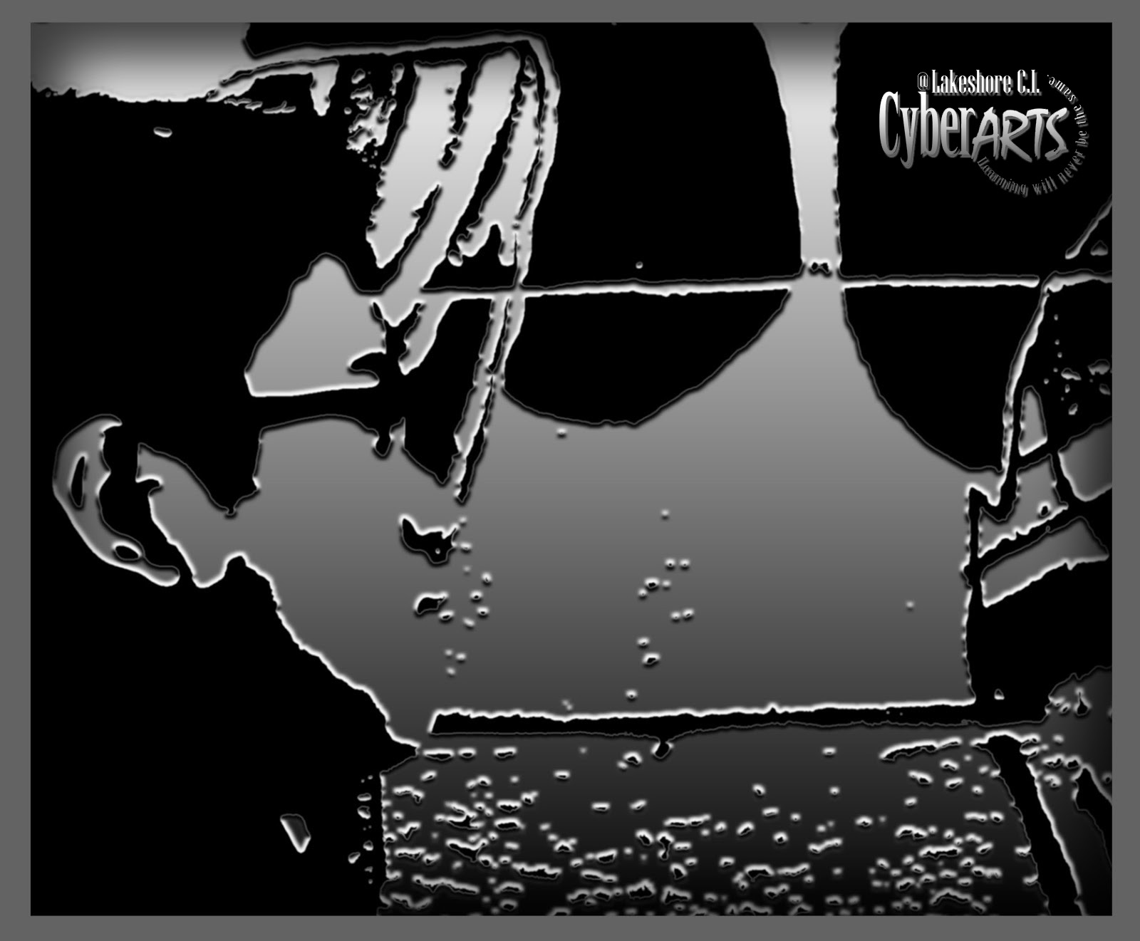
Artist: Jasper Johns
Year: 1958
Type : Encaustic on canvas
Dimensions : (30⅞ in × 45½ in)
Location : Whitney Museum of American Art, New York City

    The Imitationalism of this artwork is... it doesn't look realistic or got photographed it just looks like a normal artwork. This is because the artist didn't create any negative spaces that would give them some contrasts. And also the artist did something that is impossible to have them in the real world like there are two floating flags at the front. But if this artwork looked realistic, the flags would just got overlapped, there would be less shadows around the edges, and there could be some spaces too. So this artwork is impossible to be a realistic artwork because there are no elements or principle of design that support this artwork to be realistic.

    For the Formalism part I found that there are so many repetitions, rhythms, movements, and feelings on this artwork. Example like the flags are creating a proportion by looking at their size from large to small, the position that goes from the back to the front, or the stars on the corner left that creating a pattern or the white and red lines on each flags that are linear to each other. And for the colours and lights that are on the low values. So this is a pretty wonderful job that the artist tried very carefully to create a balance. The shapes that applied to the flags I think they are just squares. The artist made them related to the actual shape of flags. For the two flags at the front on their edges, they seem to create a contrast that produced shadows. And the textures, the artist made the flags look old, dirty, stained. Those textures would create a balance to match the elements that applied to the flags and also they could show the feelings of the design. For the emphasis or the focal point of this artwork.... if we put together all the elements and principles of design it would be for the small flag, which is at the front. Why...? Because it shows us everything on there, different than the other two that only show us the outside part of them. So what I meant is.. the small flag shows us the message from all these element and principles of design that applied there.

    And for the last part which is the Emotionalism. Because of the flags that are looking dirty, stained, old. The colours and lights that are on the low values, the contrast that produced shadows and some lights, the shapes and lines that are strong. So they are actually creating the feelings of this artwork that the artist want us to know something that relates to our countries' history...passion... or it could be the importance to remember our heroes that died and fought from the world wars, for their countries to bring a victory.

(✎) Logo Assignment Part 1


   So, I chose this animal because, owls are calm, thinker/strategist, and fast. What I meant that these qualities could be represent me to be a graphics designer. So, example like calm. Calm could mean, not to hurry everything so we could get a perfect result of the design. Or thinker/strategist, owls are really good at them like when they're trying to trap their prey, or when they're trying to be invisible so they couldn't be seen by their enemy or prey. This could mean if we think something that we want but it is hard to do it and we couldn't imagine it, we could just think again and again, and don't give up. There is always a way to do the thing that we want. And for fast. Owls are very fast when they are haunting or seeing their prey and catch them by using their sense, but in design fast doesn't mean work too fast but the result is bad. In this one fast means efficiency and thinking, like we should work fast but we have to aim the design that we want and if we already have the result, we shouldn't forget to recheck the work that we did, to make sure that it got the result of what we wanted and to see how the design balanced and pleasing to eyes.

Monday 23 September 2013

(*)Blog's title name changes

     Hello everybody, so I decided to change my blog's title name. Before, my Blog's title name was UrangSundaKanada, and now I changed to MadeinWestJava CyberARTS

Thursday 19 September 2013

(✎)Profile Picture Assignment Part 2


So for the first part I just only posted the picture, but for this part I will to tell you how I created the picture. So here it is:


Hello, in this section I am going to tell you about how I created this profile picture using Adobe Photoshop. So first of all the profile picture that I took is actually my right side of my whole body and beside me there is a painted or graffiti wall, and I didn't even think that in my opinion it would look cool after I edited the picture.
So, for the editing part. First of all, I opened my picture in Photoshop and then I cropped my picture into square so, it only showed the half of my face and the wall. After I cropped it and then I actually applied a blur effect on my face so I thought that it would look anonymous. After I applied that, I was thinking that there were something that still missing. So I came up with the ideas to put more effects on it which is to apply a texture or filter on the picture, and some shading on the edges to make them look smooth in my opinion. After I applied filter/texture, then I was wondering about how do I make the edges look smooth or have more effects.  After a moment later, and then I came up to tried apply a border on the edges, which is using a square shape with no "fill". And for the colour, Because of the filter's/texture's colour is black and white so I chose the grey colour for the border to match the picture's filter/texture colour and to create a "balance" to the picture. After that I thought it looked good and fit nicely. After I applied the border and then I was thinking to apply more effects to the border which is by using the "Drop Shadow" option from the "Blending Options..." menu and played with it to make it fit and pleasing to the eye.  And after I applied that and checked how it looked, and then I thought it could create an "emphasis" to the picture, so I left it there so far.
For the last part which is the "CyberARTS" logo I just applied some effects on it which is using the menus from the "Blending options..." menu, and they were "Gradient Overlay" option and "Drop Shadow" option.
For the "Gradient Overlay" option, I just applied a "Neutral Density" type of gradient to match the picture's colours and then I set the scale of it as 51 to made the gradient looked smooth, and then I set the style as "Linear" and blend mode as "Normal", and set the angle to 90 degree. For the "Drop Shadows" option, I just set the angle to 120 degree to match the picture's shadows and lights, and then I set the distance to 5 and the size to 2 to avoid the shadow from too angled . And then for the last part I set the contour type to "Rounded Steps" to made it balanced.
         So, that's all, thanks for reading! and sorry If there are typos.


(✎)Rhythm/Repetition Assignment


Hello, so these are the assignments:

Dynamic Rhythm:


Steady Rhythm:


How I created them:

     In this section, I am going to talk about how I created the "Steady" and "Dynamic" rhythm/repetition in Illustrator. So first of all, I created these rhythms by just my random thought that I didn’t think  before. After that I created several lines that lined vertically on the bottom and also on the top. After I lined them and knew the pattern. I tried to recreated and organized them to make them more balanced. After that for the “Steady” rhythm I just went directly to make changes for each lines like, change the sizes, thickness, and distances, and make some spaces between each of them to create a “negative space” lines. And for the “Dynamic” rhythm, I recreated the lines and changed the distance and size between the bottom’s lines and the top’s lines to create a space. After I changed the distance, size and made a space, then I created four shapes which is circles in the middle that went from left to right, and then because they are shapes, so I had to cut some of their points and lines using the “scissors tool” in Illustrator to create more effects. And after I worked on those, then I started to tweak the thickness, qualities, types, and the positions, to make them look balanced and pleasing to the eye. So that’s all, that was my work so far. Thanks for reading! and sorry for the typos.

Monday 16 September 2013

(✎)Profile Picture Assignment Part 1


Profile Picture Assignment


EDIT 1

So, she told me that I need the CyberARTS logo and here it is: