Sunday 13 December 2015

(✎) Visual Identity Assignment: Initial Musing

    This month we are working on a new assignment to create our visual identity. The purpose of this assignment is to advertise ourselves and helps us to get into the design world. It is like branding ourselves. Therefore by showing our unique and designed visual identity, we would be known and recognized easily by the public as well as clients who want to hire us. Here is the definition: "Visible elements of a brand, such as colorform, and shape, which encapsulate and convey the symbolic meanings that cannot be imparted through words alone. In a broader (corporate) sense, it may include elements such as building architecture, color schemes, and dress code." [Source]


    My company has not yet been named, but the what we do mainly is industrial design. For those of you who do not know what industrial design is, generally industrial designers design human products. Everything that you see in home, school, or work are mostly done and designed by industrial designers. For example, sofas, lunchboxes, helmet. phone cases, monitor, kitchenware, printer etc.


  What our focus in industrial design is that we make small furnitures, such as chairs, drawers, cabinets, coffee tables. Tools/products, it can be anything. Small packages, it can be anything as well. We also design shelters, like bus shelter or any shelter that can protect people.

   Our goal is to make the products that really benefits people as well as environment. We don't want to create products that will make worse or harmful to the earth. We want to create products can make life easier.

  Our design goal is to create something simple but really useful, eco-friendly, and cheap. It has to look interesting and unique as well..

  The design strategy would also be really consistent throughout our website,  there will be watermark on every project's photo thumbnails. Therefore it will  look clean and organized. It will also show our identity.
 
    Overall, that is for now. There will be more updates soon.

Here is the company in outline:

- Name of company (possible names): West Java Design, Made In West Java, BDGdesign, BambooDesign, WestBamboo, TheBDGdesign, EastBDGdesign, Bandung Works, Hade Studio, Barudak Design, Rebes Studio, BDG Design, BDG works, BDG Studio Toronto, Sawargi Studio, ...

-  Company Type: Industrial design company; Only designing and producing prototypes.

-  Style: Simple, Eco-friendly, clean

- Mission: To make life more convenient.

- Design Area: We design small furniture, tools/products, small packages, and small shelters.

- Goal: We want to invent or innovate a product that can be useful and beneficial to people and environment.
"Let's save the earth, friends!"

*All Images were taken from Google

Monday 7 December 2015

(✎) 11 Most Important Elements in Infographics

       This week we are exploring a new type of design called infographic. The purpose of infographic is to tell a data, timeline, or anything in a unique and cool way. It always has a main topic. There are variety of things that can be told through infographics. For example, how to design a website:

Source: http://bit.ly/1POspoI

             I won't explain in details about it because I am here to share the 11 most important elements that infographics should have (in my opinion). However if you want to know more about it, I suggest you go to http://www.informationisbeautiful.net/ there are so many good infographics there.

Anyway, an inforgraphic should have:

1. Topic

Topic is one of the very important element in an infographic because if there are no topics, then the viewer will be wondering what the infographic is about.

2. Shape
  
Shape visualizes things and can be easily remembered.

3. Line
 
Line is the other important element in an infographic because it helps the readers to follow what is going on in the infographic.

4. Colour
 
Just look at every infographic, almost all of them have colours It is an important element in infographics . Just imagine, if there are no colours what they will look like? they will look boring plus they will be very confusing because there are no colour codes (except, if they done it by purpose). Therefore pick a good choice of colour and don't have too much colour as well otherwise it will be really busy.

5. Graphics (no photos)

Graphics are really important to represent figures or datas, so that it can be interpreted and remembered easily by people. Also, keep in mind: There should not be any camera photos! (but if you want to, you are welcome. It is just really rare to find infographic with photos).

6. Good and suitable fonts

Fonts can impact people's feelings and emotion, therefore having a suitable fonts for a topic is the best.

7. Texts

If there are no texts on an infographic, then it wouldn't be called infographic! it would be called a drawing.

8. Appropriate background
 
What I meant by appropriate background is that it matches the whole theme. So, make sure you have a good and matching background when creating an infographic.

9. Headline/Title, and Subtitles
 
They are one of the important element because headline gives you a first impression and subtitle tells the infographic in details.

10. Numbers
It is not really necessary to include numbers in an infographic, but it is just weird if there are no numbers in an infographic. It also helps to tell more information.

11. Introduction and Conclusion

Well this part is a bit a vague, but what I meant is an infographic should have a strong main information that  explain what the infographic is about and a conclusion to tell the viewers that it is finished.

*All images were taken from Google

Wednesday 21 October 2015

(✎) Movie Trailer Mashup Assignment

The objective of this assignment is to re-create a movie trailer and turn it into a different genre. The movie that I pick is Minions. I don't really like Minions, but read the paragraph below to know more the reason why I chose Minions as well as the steps I created the mashup trailer.

The Movie:


The Original Trailer:


The Mashup Trailer:


Artist Statement:

"The Minions are small, yellow, cylindrical, creatures who have one or two eyes", Despicable Me Wiki. "A follower or underling of a powerful person, especially a servile or unimportant one",  Google Definition. 

The movie trailer that I chose is Minions. It is a 2015 3D computer animated comedy film produced by Illumination Entertainment for Universal Pictures. This film is a prequel to the popular Despicable Me series. It was directed by Pierre Coffin and Kyle Balda, written by Brian Lynch, and produced by Chris Meledandri and Janet Healy. The film stars Coffin (as the Minions), Sandra Bullock, Jon Hamm, Michael Keaton, Allison Janney, and Steve Coogan, and is narrated by Geoffrey Rush. [Minions, Wikipedia] 

The very first thing I need to tell is that I already had an idea of what the mashup trailer would looked like and that applied to any movies, I just needed to find the best and perfect one. After I researched, then the decision fell to Minions.  

Before I talk about why I chose Minions, first of all, my mashup trailer idea was to turn any movie genres (as long as it is not the same genre) to a victorious, legendary, adventure or journey movies. Why I wanted to chose that genre? Honestly, I just like movies with that kind of genres. So it would be very interesting for me to try and see if I can change a different movie's genre to my favorite movie genre through a mashup trailer. The idea and concept of the trailer was also inspired by the "Legend of The Guardians: The Owls Of Ga'hoole" movie trailer, as well as the "Harry Potter and The Deathly Hallows Part 2" movie trailer. 

Now, why I chose Minions? I chose it because first, even though most of the time the movie's story is a mixed between comedy and somewhat action genres but it actually has some adventure clips that I can cut and put in my mashup trailer. Secondly is because the main focus of this film is only at three minion dudes, and that is very great because I really needed heroes or main characters in this mashup trailer. So I can chose those dudes as the main characters. Thirdly is because they have a lot of perfect face emotions and camera angles that can help communicate the feeling that I wanted to be in this mashup trailer. 

The original story of minions is about these three minions dudes. Here is a quote from Wikipedia: 
"Minions are small, yellow creatures who have existed since the beginning of time, evolving from single-celled organisms into beings who exist only to serve history's most villainous masters. They find great masters—including a T-Rex, a caveman, an Egyptian pharaoh, Dracula, and Napoleon,—but after accidentally killing nearly all of them with their incompetence, they decide to isolate themselves from the world and start a new life in Antarctica. By 1968, the lack of a master to serve drives them into depression, so one minion—Kevin—plans to find a new one for his people by going back into the world. Stuart—a bored, teenage minion obsessed with guitars—joins him unwitting, as does an over-enthusiastic young Bob, who begs Kevin at first, and then is chosen due to no one else willing to volunteer." 

My version of Minions is kind of have the same story but I made it more like a journey movie instead of comedy movie. What I did is I eliminated every single funny aspect or clips in the film so that there are only serious clips on the trailer. However this is my version of the story:  

The story is about these three minion dudes who believes they can help the whole minion nation to find a new home somewhere on earth after a long period of time stuck in an ice age in Antarctica. Also, in my version, they are aliens that used to live on earth with humans in past generations but because now the past generations have gone and the new generation came, they found out that the new generations don't really like minions anymore, they treat the minions like animals so therefore they were all dumped into Antarctica. Now, they wanted a new life so they decided to take on the dangerous journey to the human world again. 

The first process that I did to create this mashup trailer is actually just finding a movie that can best fit my idea because I already have the background song as well as the idea of what it is gonna look like. My background song is called The Champion by Era. I chose it because it has a victorious tone which can help support the feeling of the mashup story. For the mashup trailer, what I did first was I downloaded every Minions movie trailer because there were three of them on the YouTube, I also downloaded the original full movie on the internet. 

After I have all the stuff I need, I did a very little storyboarding and writing notes just as a reminder in case I forgot something. Then, I started by opening Adobe Premiere Pro CS6 with the setting I changed to HD. After that, I imported every trailer as well as the background song and the original full movie. 

I began the process with placing the background song first into the timeline because I wanted the mashup trailer to be based on the background song. Then, I placed each trailer one at a time on the timeline. After that, I just played around with the clips on every trailer, every time I found a good clip and match the story as well as the background song I cut the clip from the footage by using the "Razor Tool" on the timeline and placed it on a position that I wanted it to be. This is basically what I did over three weeks. 

After I have all the clips, I started to put a story to the trailer by using texts narrative, so that the viewers understand what I wanted to communicate. Then, after I finished with it, I just keep tweaking the mashup trailer until it is perfect and good to be rendered. I rendered it with H.264 option and set the resolution to 720p. 

I honestly liked the finished products. What I wanted to improve is the texts narration, I wish they could look and feel more powerful, maybe if I have more time I wanted them to be in 3D or in a 3D background.  

              Overall, I really enjoyed creating this movie trailer, I wish I can make more. I actually learned how Hollywood movies wanted to communicate a movie clearly by just using a trailer but attractive and must catch viewers attention. Therefore, trailer really matters to movies.                                                                              


Image Source:

(*) Year Four

Welcome back, this is year four.


Saturday 30 May 2015

(✎) Music Videos Over Decades

Whatsup everybody, in this post I will be discussing about music videos over the decades and also commenting about the artistic style that the music videos have back then as well as we have today. Enjoy!

PART I 
____________________________________________________________________________

1. What I think about music videos over decades is that, generally, they are all the same. They tell the story, song, and expression in the video. But what makes the difference between today's music video with past music video's is the quality of the production. Today's video are more high quality such as the video and the sound itself, while the past don't have those qualities. Also, in my opinion past videos are more creative. For example, Talking Heads - Once In A Lifetime, The Chemical Brothers - Star Guitar, and Peter Gabriel - Sledgehammer. They were the first ones who I think pushed the music video to the next level. Overall I think the past generation music videos are more emphasizing creativeness, while today's music videos are more emphasizing on the qualities, whether it is for the sound, video, etc.

2. I think The Chemical Brothers - Star Guitar and Peter Gabriel - Sledgehammer, are considered works of art in their own right, because no other music videos are the same like them, although there are some, but they are the first ones who I think invented them.

3. Obviously, the past generation music videos aren't in good qualities because technologies in innovation were less back then, so overall opinion is that the past were low quality, while today we have 4K.

4. -

5. I think a music group could try to go to the space just to film and record their music video.

PART II
____________________________________________________________________________


Peterpan/NOAH ID feat. Karinding Attack - Sahabat
Indonesian group band.

Pacing: It follows the tunes and beats.
Artistic Style: Using selective focus to blur and unblur.
Lighting: Dimmed light to helps create the atmosphere.
Artistic Intent: Trying to capture the calmness and relaxing of the song produced by the instrument.
Shot Types: Mostly close-ups to emphasize the musicians playing with the unique instruments.
Emotional theme of the music: In the shot types with the selective focus.

Owl City - To The Sky
Soundtrack for movie "The Legend of The Guardians: The Owls of Ga'Hoole".

Pacing: The lyrics match the visual representation or the video.
Artistic Style: Incorporating the clips from the movie to the music video.
Lighting: Colourful lights to match the lights in the movie.
Artistic Intent: Trying to capture the spirit of the song.
Shot Types: Variety of shots to create a balance between the clips from the movie and the video.
Emotional theme of the music: In the lighting


Sunday 26 April 2015

(✎) (✉) Basquiat Inspired Digital Image Part II


NOTE: I USED COPYRIGHTED IMAGES TO CREATE THE ARTWORK.
List of sources I used to make the artwork: http://1drv.ms/1Kl3BP7


Title: Sport, Soccer, World
Medium: Adobe Photoshop CS6

Artist Statement

     I chose to focus on the layers because my main theme is about togetherness, and I needed to combine images, which required me to do layering. The theme is inspired from a video that I watched called "Soccer and World Cup Bring Worlds Together" by National Geographic. [Video]

     The concept that I was trying to achieve is to show how soccer especially sport has made people around the world unite and create fun atmosphere in their countries. That is why, as you can see in the artwork, I put a collage, a soccer huddle photo, and a big soccer ball, which is the emphasis of the artwork.

    I put every element in the artwork with a purpose and interpretation from the video. The collage in the artwork represents the diversity of people in the world. As you can see, I put photos of people from different races and cultures. If you notice, you will also see that every photo has different border colour which helps the collage to represent the message.

     Below the collage, there are two texts saying "everybody forgets their culture and races when they play" and "soccer brings worlds together", those are two quotes I got from the video. I included them in the artwork to help convey the message that the artwork was trying to communicate. I used a drop shadow effect from the blending option tab to make the text clear because when there was no drop shadow, the text looked vague because of the colour of the background. I also added some kind of cool accidental effect that I got by masking the texts to the collage and the soccer players huddle photo.

    Then, there is a big soccer ball. This is basically the focal point of this artwork because this artwork is mostly all about it. Previously, the soccer ball was in normal shape or look. Then, I used the gradient tool from the tool box to create a fading effect on the soccer ball. I did this because it makes the artwork look professionals and helps the below elements to be visible.

    One of the elements below the soccer ball is a soccer players huddle photo. It is a cut out background photo which I did it by using the selection tool. If you notice, the photo looks dimmed. The reason is because the original colour looked to bright and contrasting, so one way I can made it unify to the overall elements was by tweaking the colour of the image by using the Hue/Saturation adjustment layer.

    The background of this artwork represents the whole atmosphere of how it is like when there is a soccer game. Aside from the interpretation, if you notice the background looks like there is only one image, doesn't it? However it is not. There are four images that I combined to make the background. So, first of all, I actually used the selection tool to the original image to cut some parts and used the refine edge option to create a fading or transition looks to the image. I did this step on the other tab. After that I copied the image to the artwork tab and positioned it. So, because there was a negative space around the soccer players huddle photo, I copied the image, and positioned the copied one below it and same as the third one. The fourth image is actually a grass texture stock photo. I pasted the image to the artwork, positioned below the third copied background imaged, and I distorted it to make the image even with the background. That way, I tricked the perspective of the image. As you can see, the players look like there are on the field getting ready to play the game.

    At last, I tweaked the whole artwork by fixing some elements, colours, and I also added a Hue/Saturation adjustment layer to make the artwork dimmed.

    Overall, I very satisfied with the result. I actually learned a variety of new things. From composition, colours and interpreting a message on an artwork. However, one thing I really learned is that I always use photoshop just to create graphics, I rarely make something like this. Because I used to think that it is kind of impossible for myself to create a design from a photo. I do not know why, it was just my weakness. But when I finished working on this artwork, I just realized that I can do more than that. Having said that, now I can explore a whole new thing in my design!

Sunday 29 March 2015

(✎) (✉) Daily Create #6

Title: Fabric Art
Medium: Sony APS-C
Picture Taken On: Sat, Mar 28th 2015
Task: Fabric: we wear it, sleep on it, decorate with it. Make a photo of an interesing cloth design or texture.


Saturday 28 March 2015

(✎) (✉) Daily Create #5

Title: Bump
Medium: Sony APS-C
Picture Taken On: Sat, Mar 28th 2015
Task: Take a closer look at where you spend a lot of time. Photograph something there you never noticed before.

Saturday 7 March 2015

(✎) (✉) Daily Create #3

Title: Garbage
Medium: Nikon D3100
Picture Taken On: Thurs Mar 5th & Fri Mar 6th,2015
Task: Something that makes you angry.

(✎) Basquiat Inspired Digital Image Part I

Short Biography

Jean-Michel Basquiat


Jean-Michel Basquiat (December 22, 1960 – August 12, 1988) was an American artist, musician and producer.[1] Basquiat first achieved notoriety as part of SAMO, an informal graffiti group who wrote enigmaticepigrams in the cultural hotbed of the Lower East Side of ManhattanNew York City during the late 1970s where the hip hoppost-punk and street art movements had coalesced. By the 1980s he was exhibiting his Neo-expressionist and Primitivist paintings in galleries and museums internationally. The Whitney Museum of American Art held a retrospective of his art in 1992.


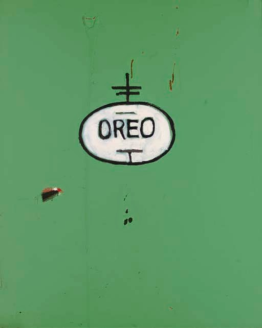
Inspired Artwork


Name: Oreo 
Year: 1988 
Medium: Acrylic on canvas 
Note: Private collection

Layer 
The layer for this painting seems to have 3 or 4 layers because there are one spots uncovered with the green paint, and inside it there is black spot, white line, and red background. 

Perspective 
The perspective seems to show his view to the people around him. Because this "Oreo" logo is not meant to be representing snack, instead it is representing the street phrase, which is "black on the outside white in the inside. It means black people act as white people. 

Tension 
The tension that is shown in this artwork seems to be having a calm emotion. This is supported by the green background and normal "Oreo" logo. But I also see some kind of angry or unpleasant feeling shown in this artwork, because there are few unfinished spots or scratches and also the border is reddish orange, which is a deep and bold colour, so they could support the feeling.