Thursday, 24 October 2013

(✎) (✉) Chess Piece Artwork Assignment


"The Space Chess"

Too Dark??
Here the brighter one:
How I created it/ The presentation:


     Hello. I will tell you about how I created this. So.. First of all, everybody in my class got their chess pieces. Some people have the same kind and some people not. Anyway I got a Bishop, which is good for me because it is not too complicated to draw. And the objective of this assignment is.. we have to create the chess piece to looks as realistic as possible by playing around with the values, contour lines, or smudging etc. We also have to set the chess piece to be the focal point. And create movement on the background.
      My first part is I started to draw some thumbnail sketches in my sketchbook. And then I came up with four ideas to choose but then I decided to pick one (which was that final image ^) and draw it for the second time to make it nicer.
     After I got my idea and drew the sketch, I started to draw my chess piece for real on a big sheet of paper. Before I started draw my chess piece, First of all I have to place my real chess piece somewhere in a room that has dark and lights so I placed my chess piece in a dark room that has a lamp beside it. And then I started drawing. The first step that I did is I drew the outline of it by using an HB type of pencil then drew the contour line. And after that I started to layer the contour line to make it as thick/bold as possible by using the 2B pencil and then the 6B pencil. After that I smudged the contour lines until disappear so it wouldn’t look like imitation. And then I applied the value to it by following real life lights then smudging and layering until it looks realistic.
     For the background, I decided to create something interesting. So my theme is “ The Space Chess” it is about a chess piece from a strange planet that wants to see its kinds in earth because it heard from its planet that there are a lot of different chess pieces in earth. Back to the artwork. I wanted to create movement around the chess piece like a real meteor/comet because the theme is in the space, so I drew a bunch of thin lines layer by layer around the chess piece until it becomes bold. After it became bold, I began to smudge the two tails at the back(as seen in the image^) until it looked fading/gradient to the front. It would create a feeling that the chess piece is coming down. I drew it using the HB pencil for thin layers and then 2B and 6B for the bold.
     For the composition, I placed my chess piece on the left corner and facing down at the bottom right corner. Because, instead of placed in the center, I would preferred play around with the position and choose for the best one. And it also matches the artwork's theme. For the size of the chess piece... I made it looks bigger than the earth to create a proportion and to make the chess piece as the focal point/ emphasis of this artwork. The next is the earth. Because I said that this artwork is about a chess piece that is coming to earth. So I drew the earth right on the corner right. I made the earth looks small to create a proportion and balance. After everything is finished. I added the value to the background by drawing a bunch of lines on the top, bottom right, middle right, and behind the chess piece. After all finished, and then I smudged half of them until they look balanced and fading to each other. The value on the background helps create movement and to make it look like in the space. So... that is it thanks, sorry for grammar mistakes and typos.

Thursday, 10 October 2013

(*) Blog Update #1

    Helloooo everybody, in this first Blog Update I just want to tell you that later on I'll use tags for each of my blog post's title. And the tags will be :
(✎) <-- For Assignments
                         (⌨) <-- For Entertainment/Random Stuff
(*) <-- For Blog Update
(?) <-- For Infos

I think so far that's it. I might change those later. Anyway thank's, and sorry for the typos.

Sunday, 6 October 2013

(✎) (✉) Logo Assignment Part 2

Logo Assignment Part 2 section 1: The Logos
Main Colour Version
 
Other Colour Version
  
Black & White Version
 

Logo Assignment Part 2 section 2 : Written Statement

       In the last few days, I have been working on the logo assignment, which is to create a logo from animal that represents my qualities on design. I got confused for the first time to chose what animals that best represent myself. So, I came up with three animals to choose which are tiger, eagle, and owl. Because tigers were kinda hard for me to think, and eagles that kinda common, so I decided to chose owls. Why I chose owls..?? Because, owls are calm, thinker/strategist, and fast. What I meant is.. these qualities could be representing me to be a graphics designer. For calm, calm could mean.. not to hurry everything. So we would get a perfect result. Or thinker/strategist. If in the owls side, it is like when they're trying to trap their prey or trying to be invisible so their enemy or prey couldn’t see them. If in the design side, it could mean we have to be creative or work hard and use our brain to make it better. And for fast. Owls are fast animal, they always react if they see their prey by using their sense. In design “fast” means efficiency and thinking. We should work fast but we have to aim the design that we want and if we had the result, we shouldn't forget to recheck. To make sure it meets the design of what we wanted.     
       In the designing part. Because of my company's name is “Flights Studio” so I planned to use a cool/light colours, because it will represent the “Flights” word which relates to the sky that is clear and beautiful. I started designing using the Pen Tool to trace the owl from an image that I got from the web. I decided to create a curvy smooth line, for the owl’s body. Because it will create the details to the smooth edges from its wings and other parts. For the eyes, I chose to create a half circle shape because it will help create a balance to the owl’s body's direction. For the face, I just make it similar to the actual shape of its face, because it also helps create a balance to the body and the eyes. In typography I used a thin, simple, clear looking font for eyes because they represent the company's name. The font that I used was Caviar Dreams (it is actually a custom font). I positioned the typography below the left wing and placed it away from the owl a little bit so it lined in the center. I positioned the typography there, because it represents the company's mission. The mission is “we work as a team and help together to reach our dream to be a five star company”. The colours that I applied to the typography or the company's name are using two different colours. For “Flights” I chose a cool/light blue colour because it represents the sky. And for the “Studio” I chose a cool/light grey colour. For this one, there isn't any meaning but it helps to create a contrast. Talking about contrast, I tried to create a few contrasts that were possible to each part of the body. Because contrasts could help create differences on the logo. Like the owl's eyes and the face. I applied a light grey colour to them, but then for the face, I dimmed the colour for 70% because if not, it wouldn't create the contrast. For the background, I didn't really want to have them. Because it would ruin the balance and the contrast of the logo So I decided to leave it with just a negative space. After all finished and for the addition, I added a line and created it with the Line Tool. I positioned it below the company's name and lined vertically. And then. I applied a white & grey gradient to it that goes from left to right and changed the type of it to oval to creates a movement, values and represents the company's feature which is efficiency. And I also add another thing which is a shadow. I applied it to the owl and created it by just copied the main owl's body and placed it underneath the main body. And applied a sky colour gradient to it, to helps create a movement and represents the company's work that they are always there. For the unity, rhythm, and the others, I didn't really create them because I want to keep the logo as simple as possible. But for last part, the emphasis. This logo was actually didn't have an emphasis, I didn't think about creating an emphasis. But after I finished design the logo, it seems that the face could become the emphasis. Or it could be the “Flights” word too.
      In the technical part, I don't really have anything to say. I just learned so much about Illustrator. When I was creating the logo, all the things that I used often was just playing around, editing, rechecking. But for the tool , it was the Pen Tool. The Pen Tool was a perfect tool for tracing anything on the image or even create something that you want. It is also a neat tool for creating a line. For the effects, so far I didn't apply any. Because I didn't think about adding any effects. For the use of layers. Layers are very important things that need to be use in every case. Like if you have a complicated design, you should use the layers to organize things. In my case I used layers for organizing every parts of the owl's logo, including the typography. And also, I used layers to make things more neat and tidy.
      For thoughts and opinion about this assignment. I'm really happy about what I have done. Because, previously I didn't know how to use Adobe Illustrator. I thought it was a complicated software. But when I tried to work on Illustrator, things went different. And then I got used it. it was like Adobe Photoshop but in different format. I learned so much about designing a logo especially when I tried to create a contrast and tweaking the logo. After I finished creating a logo in Illustrator, I am planning to create another logo if I have time. I want to learn more about using the tools and the colours in Illustrator. It was a fun experience.

Wednesday, 2 October 2013

(✎)Daumier's The Third-Class Carriage Artwork Grid Group Assignment


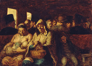
Original Artwork by Daumier
                                          Artist  : HonorĂ© Daumier
                                          Year   : 862-1864
                                          Type   : Oil on canvas
                                          Dimensions:  65.4 cm × 90.2 cm (25.7 in × 35.5 in)
                                          Location     : Metropolitan Museum of Art

The Third-Class Carriage evidences Daumier's interest, as also seen in his graphic works, in the lives of working-class Parisians. Third-class railway carriages were cramped, dirty, open compartments with hard benches, filled with those who could not afford second or first-class tickets. In the bench facing the viewer are seated, from left, a woman holding her baby, an older woman with her hands clasped atop a basket, and a young boy asleep. Seated behind them are anonymous rows of women and men. The painting entered the Metropolitan Museum in 1929 as part of the H. O. Havemeyer bequest. Source: wikipedia.org

The "Grid" version of the artwork by L.C.I CyberARTS 2013 Year One Students
    So, this one above is the "Grid" version of the The Third-Class Carriage Artwork. We did this by groups. First of all each student got a card that has a sketch on it. And then we had to redraw it on a new paper by using a charcoal. After everybody finished redrawing, then we put all together on a flat table and took a picture of it and edited with Adobe Photoshop. And then we finished, sorry for mistakes.