Showing posts with label Year Two Assignment/2014. Show all posts

Monday, 16 June 2014

(✎) (✉) Video - Self Portrait Culminating Assignment


Video-Self Portrait Project Statement
Name: Hamzah

This is my Video-Self Portrait; I finished this project on Sunday, June 14th 2014. The title is “Don't give up”. The goal that I was trying to achieve is to create a video that has a powerful message, which the meaning that I was trying to communicate is to show confidence and never give up in everything; always try the best. The mediums that I used to create this project are; Adobe Premiere Pro CS6, a Nikon Camera, a Canon Camera, and a Motorola Phone.
       
       The idea behind this project is to show optimist and never easily give up, and the story behind this project is about my life. So, talking about the videos, I will try to describe each scene or part. So first of all, this video is about a homework or assignment that will be due the next day, and while that, I haven’t done any of it because of too much assignments that I got from other classes, so I got confused, feel hard and overwhelmed.
       
         So, first scene, I chose a table as a place to study and the story is, I usually study or do homeworks/assignment at that place, but because I had too much things to do and overwhelmed, so I left it. That's why it is dark and quiet. I also used a heartbeat sound in the background (that will continue until the fifth scene and...) to represents nervousness and help support the atmosphere. Second scene, the calendar is representing the due date of the homework/assignment, and the ”homework due” text that is moving back and forth, helps to communicate the meaning and also the fast ticking clock sound is helping to communicate the meaning as well as representing “hurry”. Third scene, it represents that I am kinda giving up on the homeworks/assignments, and decided to go home. Fourth scene, it represents that I arrive at home and still in nervous feelings; again by the heartbeat sounds. Fifth scene, the story is, I went to my room and wondering about my problems, and I really don’t know what I am going to do; confused and overwhelmed. It represented by my mood and position, which is shown by the way my head looking down and seemed to be wondering about something. It also represented by the confusing sounds, a bunch of texts that are flying above my head, and the layered sounds that are suddenly appeared. So it became more confusing. Sixth scene, this part is telling that I am wondering about something, which is the time. It represented by the clock, so I am thinking that I am wasting time and I shouldn’t do this, and it is also supported by the ticking clock sounds in the background. Seventh scene, it goes fade a bit, and opened by me in other place but still in the same position, which is looking down. But this time, the story is, I have realized that I shouldn't give up and stop now. I should wake up and try to trust in myself and be optimist. And then, it fades (to helps create the feelings of victory or triumph) and I raised my head up with a vision of full of hope, confidence, optimist and never give up. And the background sound is starting to disappear and the music is starting to raise as my head goes up. Eighth scene, it fades a bit, but rather than “black fades” I used “white fades” to represents triumph and victorious end. After that, the scene is showing me that I finally realized and decided to work hard and study for the homework/assignments at the place where I usually study, which is the table. And then, there the words, they are the characteristics that usually helped me to be strong when I have a bunch of work that have to be done and I get overwhelmed. Ninth scene, it is telling that I finally succeed with my work and won an award that I didn't expect before. And then, I put my last message in the video which is saying that “You can do it!”. It means, if we have problems there are always ways to solve them, so don't give up.

    Overall, this is all about my life; if I got too much homework/assignments, I sometimes feel overwhelmed and confused, but later I often realized and raised and try to do my best. Anyway, I am satisfied with my work. I really like the background music that I found, because it matches the project's theme and giving a victorious and triumph feelings, which is the feelings that I wanted since in the beginning. I had learned a bunch of things from this, such as using Adobe Premiere Pro CS6, how to shoot video properly using cameras or other devices, how to fit musics or sounds properly with a footage, and how to create a powerful message, etc. Anyway, this was a good experience for me.

Saturday, 10 May 2014

(✎) (✉) Ten Photos Assignement

Hello. this is for the ten best photos assignment. I took a lot of photos but these are the photos that I picked the best.


Saturday, 3 May 2014

(✎) OCADU Program Reviews


         Hello. On Friday we've just had a field trip to OCAD U about its Graduation Exhibition. It was a such nice trip. There were many programs at OCAD U that I interested in such as Digital Futures; it is about technologies in the future, Advertising, and the one the I am really interested in is Graphics Design.
         Why I like Graphics Design?... Well, because I really like to design something such as making posters, logos, brands, backgrounds etc. And also, make motion graphics like Kinetic Typography. The second reason is because I enjoy working on computer's CG softwares such as for Adobe's, Autodesk's, and other CG products. And the third reason is because Graphics Designs are cool, simple, attractive, and eye-catching.

OCAD U Website: http://www.ocadu.ca/

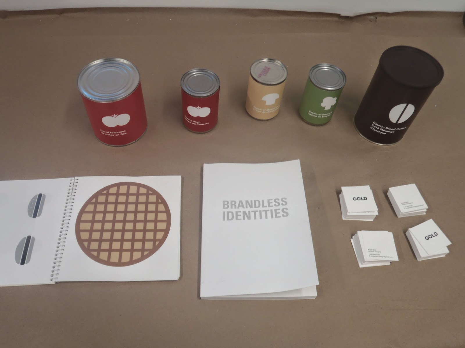
These are the photos from the Exhibition:

- Artist Name: Ivan Zhao
- Website: http://ivanzhaographic.com/


- Artist Name: Fatima Almuhtaram
- Website: http://fatimaalmuhtaram.com/


- Artist Name: Paige Gold
- Website: -
- E-Mail: paigegold.design@gmail.com


- Artist Name: Matthew Chrysler
- Website:behance.net/mattchrysler
- E-Mail: mattchryslerdesign@gmail.com


- Artist Name: Sogol Shahroudi
- Website: -
- E-Mail: sogolshahroudi@hotmail.com


"Do any of these programs seem like something you'd like to study further? If so, why? If not, why not?" Yes. Because I enjoyed creating designs and motion graphics.

Thursday, 10 April 2014

(✎) (✉) Kinetic Typography Project


Hey, welcome back! this is my finished work of the animation. check it out :


Artist Statement

This week we have been working on our new subject of animation, which called “Kinetic Typography”. What is it?... it is a type of animation that only consists of texts/words and sounds, but sometimes it has pictures and images too, and even videos. And the main purpose is; to represents voices by animated texts, such as (if you knew it) those F-150 ads. However, because this is our first time created this animation, so our Kinetic Typographies are based on movies, songs, and speeches. For me, I decided to do a clip from a movie called Monsters University (made by Disney*Pixar); which is at part (if you have watched it) when Terry and Terri got arguments.
        
         Anyway, after two/three weeks I have been working on this project, finally I finished it! I gave it a title called “ Terry & Terri Kinetic Typography”. I used Adobe After Effects CS6 to create the final product and Adobe Audition CS6 for cutting/mixing sounds. The content of the work is about twin sibling brothers, which their names are Terry and Terri (they are the characters from the movie), and their dialogues’ represented in the animation by different colours but using the same tone. However, about the story, based on the actual clip, they are siblings that are trying to introduce themselves to the audience, but because one of them doesn't agree about the introduce, so they get a little arguments that make them become funny.

          My favorite thing about the final product is the design, because after I finished work on it, I realized that the design is actually quite match the feelings of the dialogues such as the fonts and the background. On reflection, I probably would like to improve the styles, because a few of the animations didn't match the feelings, what I meant is… the design is fit but some of the animations are weak, such as for the texts that represent the Twelve Principles of Animations; they somewhat need to improve; to make them look more interesting. My design choices were first of all they have to match the feelings of the dialogues, medium/suitable fonts, balanced colours, and balanced contrast. To made it that way, first of all I had to observe the dialogues, which later made the feelings and then represent them by colours. After that, I picked a few fonts, which are Abadi MT Condensed Extra Bold, Rosewood Std, Bauhaus 93, and Apple Casual that would represent some texts, and I applied the colours to them, which are light orange for Terry and orange for Terri, and also at this time I picked a colour for the background, which is red. By the way, for the background, it's not just a red solid colour, but I also added a gradient to the red colour to make it look more fancy and comfortable to eyes. I added it, by go to Effects->Generate->Ramp, and I just played around with the options.

         The challenges that I found most difficult were at timing and animating. I found them difficult; because, first, for timing, I had to really pay attention about what the persons are actually saying especially for “quick” speak. For animating, first of all I didn't have any ideas about how to make them look fancy or cool, so I was just creating the texts first and place them at the proper time. But then, I played around with them and try a few animations and then I had my ideas. On the other hand, the solutions that were most satisfying and successful are for the animations. Because, I really didn't have any ideas about how it should look like, what I meant is... I did have the layout or storyboard, but I didn't have anything to make it look more interesting or represent the Twelve Principle of Animation. So, after a several try of styles of animations for the texts, finally I found what I want.

         Anyway, I would really want to create another Kinetic Typography, because so far I think this subject is really matching my style. I really enjoyed and like it. And also, maybe improve my skill on it.

===========================================================
Original clip:


Wednesday, 19 March 2014

Saturday, 1 March 2014

(✎) Kinetic Typography Research

Hellow!, welcome back! this post is about Kinetic Typography. The purpose is to find any Kinetic Typography video that has 12 principles animation. Like this video below :

McDonald's - Little Tasters Commercial

           
If the video doesn't work click here.

The 8 Principles are at :
0:06 - Exaggeration (The Weight or Stone)
0:07 - Secondary Action ( "Melt" word)
0:07 - Timing ("Melt" word)

0:15 - Squash and Stretch ("Considerably Scrum...)
0:18 - Staging  ("The Food")

0:19 - Arcs (The Words or Sentence)
0:19 - Follow Through ( The Words or Sentence)

0:25 - Appeal ( The McDonald's Logo)


That's all I got so far, thank you for following and see you.

Thursday, 20 February 2014

(✎) (✉) Vector Art Pen Assignment


The purpose of this assignment is to develop our skills on the “Pen Tool” in Adobe Illustrator. Our goal is to create a realistic object by using a real photograph as a reference. 


 The original Image and Supporting Image:


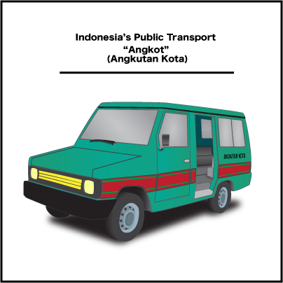
Vectored Results:


*Angkutan Kota means City Transportation
For more infos about Indonesia's Public Transport click here


      The images that shown above are vector graphics. But I saved them as .png formats. I saved them as .png formats, because based on this website and this website that I read, the format .png is more stable for the web, it has more colours compared to the others, it could remove jagged edges with the Anti-Aliasing option and it produces better quality rasterized images.

     The procedure about how I created this artwork is first of all I went to a website which is Google, and I searched for the images that I wanted. By the way, the first object that I chose was a traditional instrument. But I decided to cancel it, because the instrument is kinda small. So I decided to choose a car as my object. Anyway, then, I opened Adobe Illustrator and create a document with the option of 400 x 400 pixel and RGB colour mode, I opened the picture and resize it with the “Selection Tool”, and then I started to create the shapes for the car such as the body, the bumper, wheels, windows, and the doors. But, before I began creating things, the first thing that I had to do is create the layers. Because they will help keep the document organized and easy to modify. After that, I created the shapes of them on their layers by using the “Pen Tool”. The techniques were beginning by placing the anchor points on the paths that I wanted. For example, let's say I want to create the shape of its body. So first of all, all I need is to go to its layer and create the path, which is by following the body's shape and place the points around it and remember don't place to much points or you will end up having a complicated and an odd result. After I did that, then I filled the paths with colours and strokes which is by going to the bottom left sidebar and pick the colours. For the wheels, to get the 3D effects, all I need was just use the "Blend Tool", The procedure was first of all I created the shape of the wheel and duplicated it by going to Edit->Copy and pasted it behind the first shape. After that, gave them colours, but the first shape must have a brighter colour than the second shape because it will help them to have a realistic light values. After that select both of them and click the "Blend Tool" (it is on the left sidebar) and bum! The shapes will join together and it will create the effect. For the interior, it was the hardest part for me, because I couldn't get the perspective of it but at last I got it. How I created it?.. Basically, all I did were just the same things, but to get the effect, I used the colours value to help it look 3D. For example, if see you see clearly, the outer part is more brighter than the inside because if I used the same value it will look flat and won't have the effect and also, if you notice there is a line in front of the seat that helps lead your eyes to go inside. For the other parts/shapes, all I did were just the same thing because the purpose of this assignment is only to learn more about the "Pen Tool". But for the last step, I tweaked everything, organized the layers, and created some shadows for some parts. By the way, I created the shadows by using the "Pen Tool" too. I created the shadows by creating random shapes first and apply the blur effect to them, because the effect would help them look like real shadows, I applied the by effect by went to Effect->Blur->Gaussian Blur... and I just played with the Pop Up-Menu.

      The challenges that came across my way was the perspective illusions. It was so hard to understand the perspective because I had to deal with a lot of things like creating the details, matching the colours, etc. The hardest parts were the interior and the rims. Like what I said before, I couldn't figured out how I would be able to create the illusions for the interior and the 3D effects for the rims since they are 2D shapes, but at last I figured it out which is by playing with the hue values, opacity and create some shadows.

     I am pleased with my result because I have never done any of this project for a long time and this is also my first time I created a vector graphics using a perspective illusions. I learned a lot of things from this project, I wish I could do more.

Friday, 7 February 2014

(✎) (✉) Pixel Portrait Assignment


Hello.Welcome Back, to our new assigment. This assignment is about a Pixel Portrait. The purpose of this is to create a Pixel Portrait of ourselves, so check it out. 


        Hey, Those two are the same, don't they? Well, if you try to enlarge it, you will see the difference. The left one is on a .gif format and the other one is on a .png format. What is the difference? So, basically GIF stands for Graphics Interchange Format. It is a bitmap/raster image format. So far from what I've known,  .gif format is usually used by people to create animations but for 'still image' i don't know yet. For PNG, it stands for Portable Network Graphics. It is also a raster image format. So far, I found .png format is more better than others, it often produces better quality images. But in this case, both format for me.... first of all they look the same. So far from what I've seen, the quality of the .png (in this case) is much better than the .gif. The .png is much more smoother and the colours look more balanced and contrasted. The .gif, for overall, it almost has the same quality as .png format, but it just loses some values and colours (some of the parts are kinda dark a bit, like the hair and the details). Anyway, The features and characteristics that I was attempting to accentuate is my looks. The first feature that I found interesting is my sweater. Because, i don't know why but so far everytime I go outside, I usually wear my sweater and my jacket. I rarely wear only a shirt. The second feature is my glasses. I always wear my glasses everyday. The colours that I chose for this artwork are all based on the actual colours. Like the sweater. jacket, glasses, and my shirt (inside).
         How I created those?....hmm.. First of all, I opened Photoshop, create a new document with the options of 100 x 150 pixels, RGB colours, white background, and 72 resolution. And then, I searched for some photos of myself on my computer and find a good one. Then, I opened it on Photoshop. I cropped it to 100 x 150 pixels to match the actual document's size and resolution. I added a new layer above the photo's layer and I picked the colour of my skin by using the "Eyedropper Tool" and began tracing my face over the photo by using the "Pencil Tool" with 1 pixel-size option (but in some cases I changed the size to somewhere around 4-10, because it makes me easier to fill big parts). I traced the face by following its shape... After I got its shape, then I added the other things. Such as the mouth, teeth, eyes, eyebrows and nose. For this section I worked on separate layers, so each part have their own layers and I also worked under the photo's layer (before, I was working over the photo's layer) and just turned the "Visibility" On and Off to see what was going on. And basically, all I did was just trace the parts of the photo that I want.... For the glasses and the hair I just drew what they supposed to look because if I had to trace them, it wouldn't look nice because those parts in the photo were kinda dark and pixelated. Anyway, I picked the proper colours by using the "Eyedropper Tool" again, and drew them by using the "Pencil Tool" with 1 to 4 or 6 pixel-size option. For the glasses' lens I turned the opacity down to somewhere around 37 (by right-clicking the glasses' lens layer and then click the Blending Option... and turn the Opacity down). Because, it helps the glasses look realistic. For the last step, I just tweaked everything and added some highlights or details to each parts/corners to help them look like "8 bit" or "Pixelated". Like in the old video game, like Super Mario Bros. Anyway, thank you and sorry for mistakes.